Stack & Spoon is a business specializing in teaching workers with sedentary lifestyle ways of making their food and lifestyle healthier. They value authenticity and emphasize the importance of bringing wholesome, achievable and healthy foods to the table.
Challenge: To create a logo that will appeal to people working in the technology industry.
It has to look inviting, simple, wholesome, natural and fun and has to steer away from looking like a restaurant.
It has to look inviting, simple, wholesome, natural and fun and has to steer away from looking like a restaurant.

B. 3 Logo Concepts
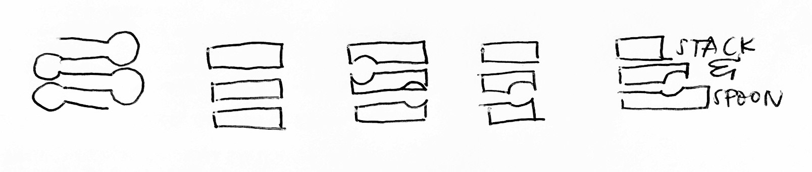
A. Logo Process
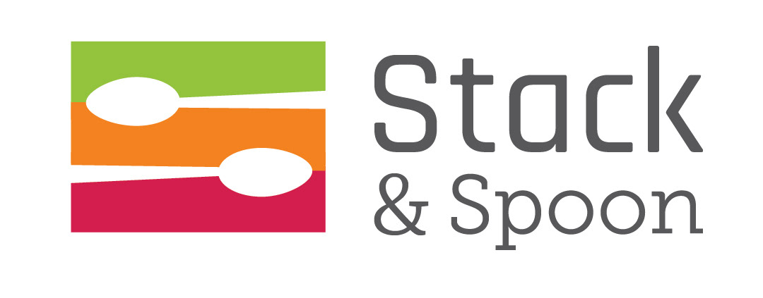
B. Final Logo
Solution: I made the logo minimal by making use of the negative space to create the spoon graphics. I then decided to tilt them to create a sense of movement and evoke fun and authentic look to the logo. I used the colours green, orange and red violet to make it look natural, fun and inviting and paired it with a rounded font to make it look friendly.